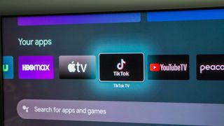
Google TV redesign will say goodbye to boxy app icons

What you need to know
- Android Developers previews a Google TV home screen redesign for "early 2024" that will bring in circular app icons.
- The purpose is for the OS to better use its space and as a result displaying more apps for users in the "For You" section.
- Developers must adhere to the TV app guidelines and suggestions by Google to ensure their icons appear professional and without blurring.
Google TV is set to receive a major redesign next year, according to Google.
Detailed by Android Developers on Medium, the company plans to roll out a home screen redesign for Google TV early in 2024 (via 9to5Google). Michelle Clark, product manager of Android TV, states this visual overhaul will see app icons in the "For You" section become circular instead of the rectangular ones currently on the platform.
Google elaborates on its focus on space management, saying users will see more of their apps easily because of the circular app icons. The early example shows how icons will look and how many may fit in a single view sporting the new design. The example shows room for more side-scrolling, much like how the OS operates currently.

Other than calling attention to an upcoming visual change, Google is giving app developers ample time to manifest their changes in accordance with the TV App icon guidelines. To avoid getting technical, the company encourages developers to utilize "Adaptive Icons" and vector design formats to ensure their icons remain high in quality.
The reason is that Google is requiring them to send in square versions of their icons, which will be made to fit in a circular shell. If developers do not upload assets bearing the proper resolution, the OS will attempt to use the highest available set on deck, but it could result in blurry imagery.
Despite the four-cornered icons disappearing, the rectangular app icons aren't going anywhere — they're being relocated. The post adds that banner assets will continue to be displayed in areas such as the "Apps" tab.
While the upcoming changes may seem small, having the ability to quickly see even more of your favorite apps in a single space might be a good thing. Google TV nowadays offers 12 apps before tossing users over to a menu containing every streaming in your possession. Hopefully, this number increases and, potentially, forgoes the need for such a menu.
Additionally, a home screen redesign like this would better separate what Google is bringing to the table visually when comparing it to Roku or Fire TV.
Sign up for Black Friday email alerts!
Get the hottest deals available in your inbox plus news, reviews, opinion, analysis and more from the Android Central team.

Nickolas is always excited about tech and getting his hands on it. Writing for him can vary from delivering the latest tech story to scribbling in his journal. When Nickolas isn't hitting a story, he's often grinding away at a game or chilling with a book in his hand.
